Choosing Lighting, Time of Day, and Weather for Architectural Renders
Light is not atmosphere. It is the structure of an image — the element that determines what reads and what recedes, what the viewer looks at first and what they notice second. In architectural rendering, the choice of lighting and time of day is one of the most consequential decisions in the workflow, and it is made before a single material is considered.
Architects already make lighting decisions during design. They orient buildings relative to the sun. They size overhangs to control the depth of shadow in summer versus winter. They place glazing to capture morning light or avoid afternoon heat. The render should reflect those decisions, not override them with a default noon sun.
How light reads a building
Light is what makes massing legible. A building photographed under flat overcast light loses most of its three-dimensional character — the surfaces that define depth and articulation become tonally similar. The same building photographed with a low sun casting raking shadows becomes dramatic: reveals read as deep, setbacks register clearly, the structure of the facade is immediately apparent.
This is not an aesthetic preference — it is a functional observation about how architectural information is transmitted through an image. Rendering decisions are not decoration applied after the design communication is figured out. They are part of how the design communicates.
A few specific relationships worth understanding:
- Raking light and surface texture. A low sun angle at a shallow angle to the facade reads every surface texture — brick coursing, board-form concrete, panel joints — in high relief. This is useful when the material texture is part of the design argument.
- High-angle light and plan geometry. Midday sun at high latitudes casts short, steep shadows that emphasize plan geometry — floor plate edges, roof overhangs, canopies — more than facade depth.
- Backlit facades. When the sun is behind the building from the camera's perspective, the facade reads as a silhouette. This can be dramatic for massing studies and is often the strongest read of a building's overall form.
Golden hour, overcast, and night
Golden hour
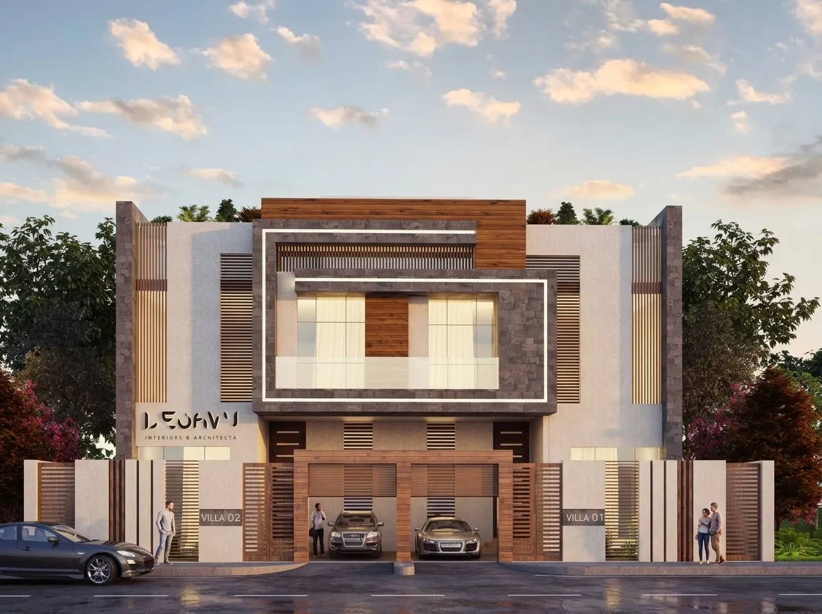
The hour after sunrise and before sunset produces warm, directional light at a low angle to the horizon. It is flattering to almost every building type and almost every material palette. Warm tone reduces the clinical quality that some architectural images carry, and the low angle reads articulation clearly.
The risk is that golden hour has become a default choice in architectural photography and rendering. Used without intention, it can make an image look like every other architectural image. Use it when the warm quality of light is genuinely appropriate for the project — residential projects, hospitality, buildings where warmth is part of the narrative.
Overcast
Overcast light is diffuse, neutral, and shadow-free. It eliminates contrast entirely, which means massing reads through shape alone rather than through shadow. This is appropriate when:
- The design's form is the argument and material texture is secondary.
- The project is civic, institutional, or commercial, where emotional warmth is not the primary communication.
- The image will be used in a planning submission or technical document where the architecture should read cleanly without atmospheric editorializing.
Overcast light also allows interior visualization where natural light enters from multiple directions without a dominant sun source competing with the artificial lighting scheme.
Night and twilight
Night and twilight renders shift the dynamic entirely. The building is no longer read primarily in reflected daylight — it is read through its own light emission (glazing, luminaires, lit surfaces) against a dark exterior. This is the correct register for:
- Commercial, hospitality, and retail projects where the building's nighttime character is as important as its daytime character.
- Any project where the glazing pattern and interior/exterior light relationship is a design feature.
- Presentations that want to convey the experience of arriving at a building in the evening.
Twilight — the transition between day and night where the sky retains some blue tone and the building lights begin to register — is often the most compositionally interesting moment. It combines a readable sky with visible artificial lighting in a way that neither full daylight nor full night achieves.
Weather and atmosphere as storytelling
Weather is not just a background condition. It changes how a building is perceived, and the choice of weather in a render should reflect what you want the building to communicate.
- Clear sky with saturated shadows reads energetic and optimistic. Good for projects that want to convey confidence, precision, and clarity.
- Thin cloud cover with softer shadows is more relaxed and approachable. Often appropriate for residential projects where liveability is the message.
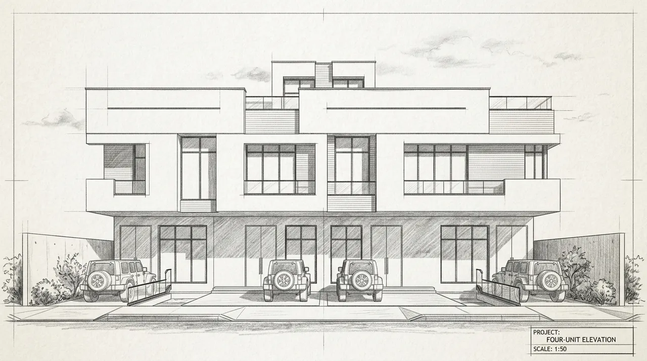
- Heavy overcast with no shadows is analytical and neutral. The architecture has to stand on its own without light doing any persuasive work.
- Rain or wet surfaces adds a layer of environmental presence. Wet pavement reflects the building and the sky; rain implies the building being used in real conditions. This can make a project feel less like a visualization and more like a photograph.
- Haze or atmospheric perspective can convey scale in large-site renders, pushing distant elements back and emphasizing foreground massing.
The choice of weather should connect to the project narrative, not be selected randomly or defaulted to clear and sunny because that is the easiest choice.
Matching mood to the project
The practical question is: what is this project about, and which atmospheric condition reinforces that?
A community center benefits from warm, accessible light — morning or afternoon sun, clear or lightly clouded sky, a sense of the building being open and welcoming. A museum or cultural institution often reads better under dramatic or neutral conditions that foreground the architecture without softening it. A housing project needs to look liveable, which usually means choosing a condition that connotes good weather in the actual location of the building.
These are not rules. They are starting points for a decision that should be made deliberately.
For guidance on how to apply these controls in Arqina, see Photorealistic Renders Without Writing Prompts. For a specific workflow applying lighting choices to a Revit source, see From Revit Viewport to Photoreal Render.
Lighting and atmosphere are controls, not accidents. Use them as deliberately as you use your design tools, and try the approach on your own projects by joining the Arqina beta.